

定位叠放顺序:z-index
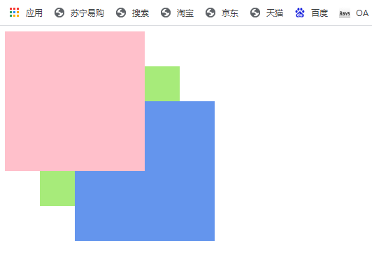
有几个盒子都是使用了定位,不做处理的话,默认后面的盒子会盖住前面的盒子,要自定义盒子的层叠排列顺序,可以用css的z-index属性
使用方法
z-index: 数值
eg:
z-index: 1;
z-index: 2;
没写的话默认是z-index: 0;
后面的数值越大,代表层叠权重越大,例如2的会压住1的,依次类推
不写z-index的盒子默认
代码示例1:
<!DOCTYPE html>
<html lang="en">

<head>
    <meta charset="UTF-8">
    <meta http-equiv="X-UA-Compatible" content="IE=edge">
    <meta name="viewport" content="width=device-width, initial-scale=1.0">
    <title>定位练习</title>
    <style>
        .one {
            position: absolute;
            z-index: 3;
            width: 200px;
            height: 200px;
            background-color: pink;
        }

        .two {
            position: absolute;
            z-index: 1;
            width: 200px;
            height: 200px;
            margin-top: 50px;
            margin-left: 50px;
            background-color: rgb(167, 235, 122);
        }

        .three {
            position: absolute;
            z-index: 2;
            width: 200px;
            height: 200px;
            margin-top: 100px;
            margin-left: 100px;
            background-color: cornflowerblue;
        }
    </style>
</head>

<body>
    <div class="one"></div>
    <div class="two"></div>
    <div class="three"></div>
</body>

</html>
未设置z-index时效果:
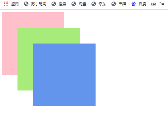
设置z-index后效果:
注意:定位的盒子加上z-index才有效
绝对定位的盒子居中算法
普通的盒子加上:margin: 0 auto 可以使其水平居中,但是如果给盒子加上了定位,再加margin: 0 auto就不能水平居中了
如下:
代码示例2:普通盒子加上:margin: 0 auto后水平居中
<!DOCTYPE html>
<html lang="en">

<head>
    <meta charset="UTF-8">
    <meta http-equiv="X-UA-Compatible" content="IE=edge">
    <meta name="viewport" content="width=device-width, initial-scale=1.0">
    <title>绝对定位盒子居中练习</title>
    <style>
        div {
            width: 200px;
            height: 200px;
            margin: 0 auto;
            background-color: pink;
        }
    </style>
</head>

<body>
    <div></div>
</body>

</html>
效果:
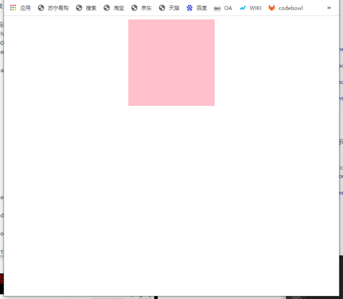
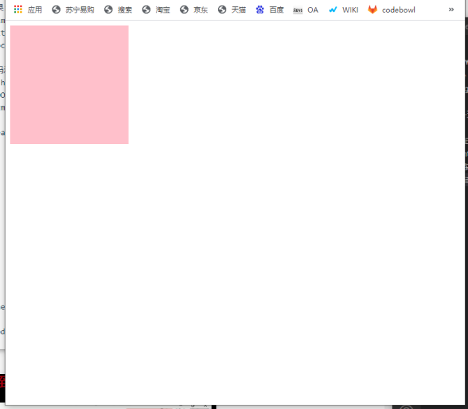
代码示例3:绝对定位盒子加上:margin: 0 auto后不能水平居中
<!DOCTYPE html>
<html lang="en">

<head>
    <meta charset="UTF-8">
    <meta http-equiv="X-UA-Compatible" content="IE=edge">
    <meta name="viewport" content="width=device-width, initial-scale=1.0">
    <title>绝对定位盒子居中练习</title>
    <style>
        div {
            position: absolute;
            width: 200px;
            height: 200px;
            margin: 0 auto;
            background-color: pink;
        }
    </style>
</head>

<body>
    <div></div>
</body>

</html>
效果:
绝对定位水平居中方法:
步骤一:让绝对定位的盒子先向右移动浏览器宽度的一半,即:left:50%
步骤二:让上面的盒子再向左移动盒子本身宽度的一半,例如:盒子宽度200px,则margin-left: -100px
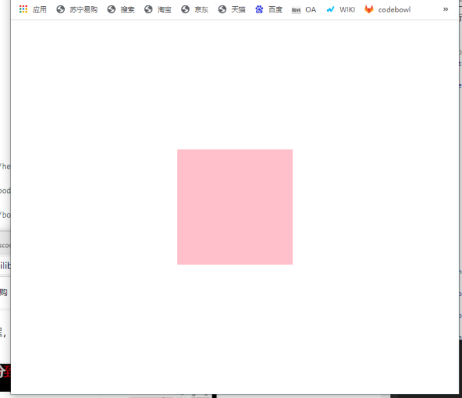
代码示例4:
<!DOCTYPE html>
<html lang="en">

<head>
    <meta charset="UTF-8">
    <meta http-equiv="X-UA-Compatible" content="IE=edge">
    <meta name="viewport" content="width=device-width, initial-scale=1.0">
    <title>绝对定位盒子居中练习</title>
    <style>
        div {
            position: absolute;
            width: 200px;
            height: 200px;
            left: 50%;
            margin-left: -100px;
            background-color: pink;
        }
    </style>
</head>

<body>
    <div></div>
</body>

</html>
效果:
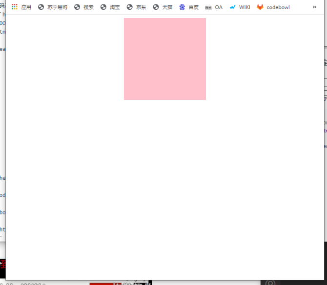
绝对定位垂直居中方法:
步骤一:让绝对定位的盒子先向下移动浏览器高度的一半,即:top:50%
步骤二:让上面的盒子再向上移动盒子本身高度的一半,例如:盒子高度200px,则margin-top: -100px
代码示例5:
<!DOCTYPE html>
<html lang="en">

<head>
    <meta charset="UTF-8">
    <meta http-equiv="X-UA-Compatible" content="IE=edge">
    <meta name="viewport" content="width=device-width, initial-scale=1.0">
    <title>绝对定位盒子居中练习</title>
    <style>
        div {
            position: absolute;
            width: 200px;
            height: 200px;
            left: 50%;
            margin-left: -100px;
            top: 50%;
            margin-top: -100px;
            background-color: pink;
        }
    </style>
</head>

<body>
    <div></div>
</body>

</html>
效果:
定位的特殊特性
绝对定位和固定定位也和浮动类似
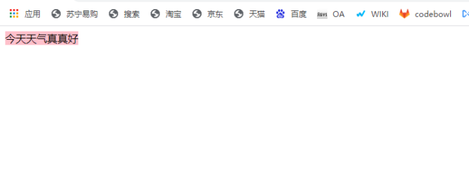
1.行内元素添加绝对定位或者固定定位,可以直接设置高度和宽度。
行内元素默认大小是内容大小,没有处理的行内元素添加宽高是无效的,如下:
代码示例6:
<!DOCTYPE html>
<html lang="en">

<head>
    <meta charset="UTF-8">
    <meta http-equiv="X-UA-Compatible" content="IE=edge">
    <meta name="viewport" content="width=device-width, initial-scale=1.0">
    <title>定位盒子的3种特殊性质</title>
    <style>
        span {
            width: 100px;
            height: 100px;
            background-color: pink;
        }
    </style>
</head>

<body>
    <span>今天天气真真好</span>
</body>

</html>
效果:
加了绝对定位/固定定位之后,可以添加宽高生效:
代码示例7:
<!DOCTYPE html>
<html lang="en">

<head>
    <meta charset="UTF-8">
    <meta http-equiv="X-UA-Compatible" content="IE=edge">
    <meta name="viewport" content="width=device-width, initial-scale=1.0">
    <title>定位盒子的3种特殊性质</title>
    <style>
        span {
            /* position: absolute; */
            position: fixed;
            width: 100px;
            height: 100px;
            background-color: pink;
        }
    </style>
</head>

<body>
    <span>今天天气真真好</span>
</body>

</html>
效果:
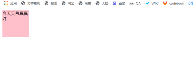
尝试了下相对定位relative,设置宽高无效
2.块级元素添加绝对或者固定定位,如果不给宽度或者高度,默认大小是内容的大小。
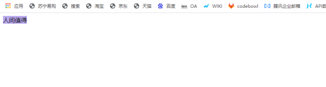
代码示例8:普通块级元素
<!DOCTYPE html>
<html lang="en">

<head>
    <meta charset="UTF-8">
    <meta http-equiv="X-UA-Compatible" content="IE=edge">
    <meta name="viewport" content="width=device-width, initial-scale=1.0">
    <title>定位盒子的3种特殊性质</title>
    <style>
        div {
            background-color: rgb(184, 169, 238);
        }
    </style>
</head>

<body>
    <div>人间值得</div>
</body>

</html>
效果:
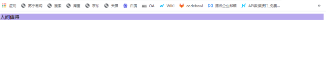
代码示例9:加了绝对定位的块级元素
<!DOCTYPE html>
<html lang="en">

<head>
    <meta charset="UTF-8">
    <meta http-equiv="X-UA-Compatible" content="IE=edge">
    <meta name="viewport" content="width=device-width, initial-scale=1.0">
    <title>定位盒子的3种特殊性质</title>
    <style>
        div {
            position: absolute;
            background-color: rgb(184, 169, 238);
        }
    </style>
</head>

<body>
    <div>人间值得</div>
</body>

</html>
效果:
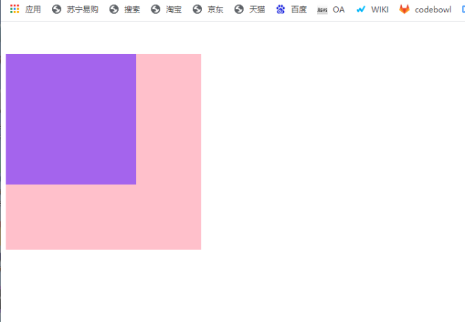
3.脱标的盒子不会触发外边距塌陷
普通盒子,子盒子设置外边距,父盒子会跟着吊下来:
代码示例10:
<!DOCTYPE html>
<html lang="en">

<head>
    <meta charset="UTF-8">
    <meta http-equiv="X-UA-Compatible" content="IE=edge">
    <meta name="viewport" content="width=device-width, initial-scale=1.0">
    <title>定位</title>
    <style>
        .father {
            width: 300px;
            height: 300px;
            background-color: pink;
        }

        .son {
            margin-top: 50px;
            width: 200px;
            height: 200px;
            background-color: rgb(164, 100, 237);
        }
    </style>
</head>

<body>
    <div class="father">
        <div class="son"></div>
    </div>
</body>

</html>
效果:
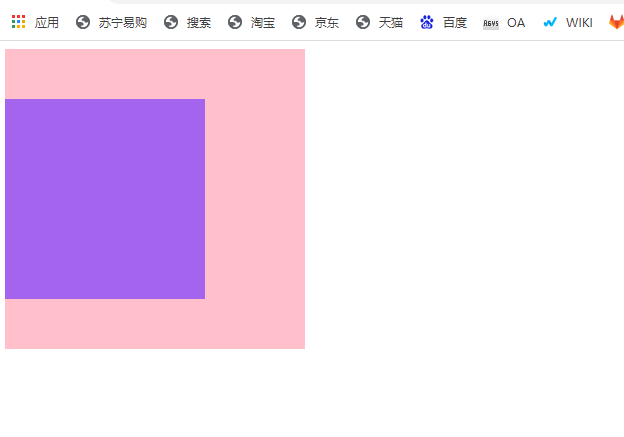
加上绝对定位/固定定位后,不会塌陷下来:
代码示例11:
<!DOCTYPE html>
<html lang="en">

<head>
    <meta charset="UTF-8">
    <meta http-equiv="X-UA-Compatible" content="IE=edge">
    <meta name="viewport" content="width=device-width, initial-scale=1.0">
    <title>定位</title>
    <style>
        .father {
            /* position: absolute; */
            position: fixed;
            width: 300px;
            height: 300px;
            background-color: pink;
        }

        .son {
            margin-top: 50px;
            width: 200px;
            height: 200px;
            background-color: rgb(164, 100, 237);
        }
    </style>
</head>

<body>
    <div class="father">
        <div class="son"></div>
    </div>
</body>

</html>
效果: